Getting your logo right is one of the key components in creating an identity for any new start-up. In Malcom Gladwell’s book, Blink, he talks about the power of the first glance – unconscious reactions and spontaneous conclusions made during the first two seconds we lay eyes on something for the first time. A logo is a visual representation, and very often the first impression, of everything your company stands for. It plays a major role in establishing identity as well as setting the tone you wish to convey to your customers.
Create a logo that conveys your values
We didn’t have a clue how our logo would turn out when we first contacted designer Oli Jones, or what we wanted the end result to look like, but what we were both clear about was that it should reinforce and relay the values we wanted users of SNAPP Guides to relate to, namely trust, reliability, creativity and accuracy.
The good news was that Oli got what we were about straightaway, plus he loves travel, adventure and photography himself, which was a huge help in getting the creative process underway.
Write a brief to set out what you want your logo to show
Working with Oli, we started by brainstorming ideas to establish a brief he could work with that would encompass our ideas and what we wanted our logo to articulate. We literally started out by noting down what the SNAPP Guides app would do for travelling photographers, as well as the benefits and our core values:
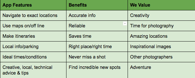 Brainstorming for the brief
Choose a look to suit your brand
We were keen to find a graphic that worked with our company name, SNAPP Guides, but that could also stand alone. The graphic would form part of our website and social media identity and we wanted it to work in the app itself where possible.
Neither of us like ‘fussy’ designs, and with SNAPP Guides being an innovative, simple-to-use app, we wanted our logo to have a clean, functional and contemporary feel.
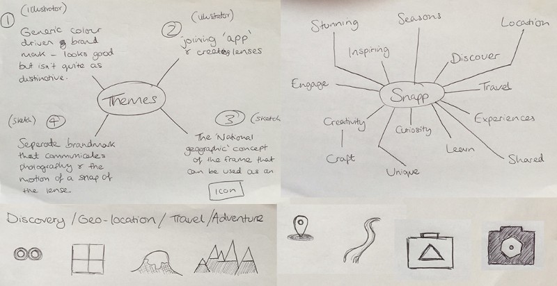 Oli’s sketch based on his initial thoughts
Go with your gut feeling…
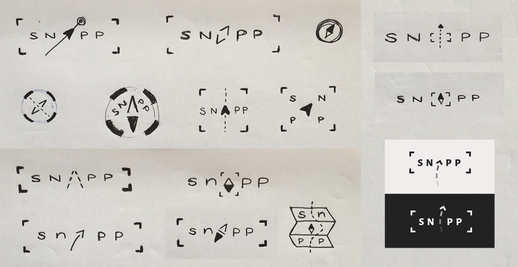
Once Oli came up with a sketch board of ideas, we were quickly able to go through and eliminate what didn’t feel right. Simultaneously we agreed we liked Oli’s suggestion to use the A in SNAPP as an arrow or compass needle. We toyed with including additional elements or more complex designs, such as the corners of a camera frame around the name, or a dotted path, but ultimately decided it was distracting and possibly a bit of a cliché. We could immediately envisage the A arrow working within the company name, but also apart as a graphic in its own right. We felt that the use of just the arrowhead represented the most elementary symbol of direction and accuracy, yet was also memorable and distinctive. We played around with colours but ultimately decided that it worked best in black and white in order to let the incredible images taken by our pro-photographers and users speak for themselves – we didn’t want the logo competing for attention. We opted for a font called Montserrat, which for us struck the right balance of being simple and modern.
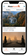
 Use SNAPP Guides to discover and get to incredible new locations for photography
Use it everywhere!
Once we’d nailed our final design, we started to use it wherever we could to establish SNAPP Guides as a trusted and consistent brand. Oli created social media header images for us and a separate thumbnail graphic with the arrow, which worked particularly well on Facebook and Twitter. We got our app developers to incorporate the arrow graphic into the app as an icon to indicate photographic spots and distance to the next locations. This means that the logo has become part of the user experience as well as the app logo users find when searching for SNAPP Guides in the App Store and Google Play shop.
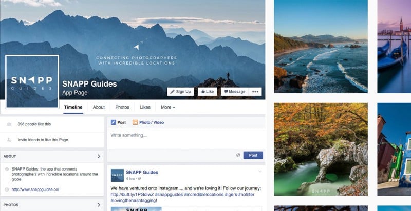 Developing the logo across social media channels
We can’t thank Oli Jones enough for the great start he’s helped to give SNAPP Guides. It’s a logo we can not only identify with, and hope our users will too, but one we can see developing with us as we evolve as a company.
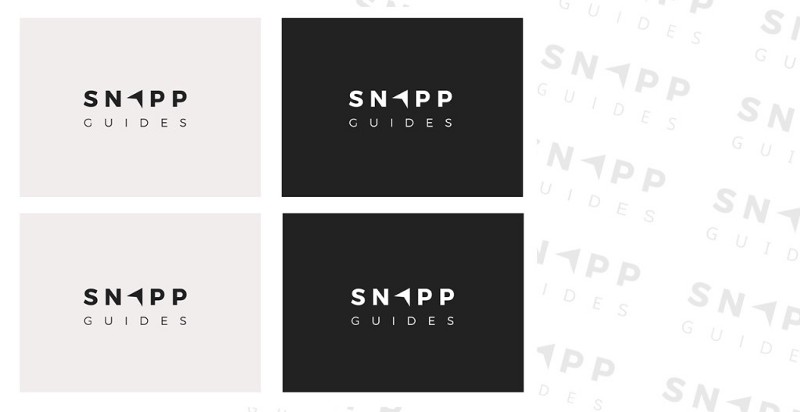 Final designs in Montserrat font